NATURE’S YOKE EGG CARTON CONCEPTS
Westfield Egg Farm | 2019
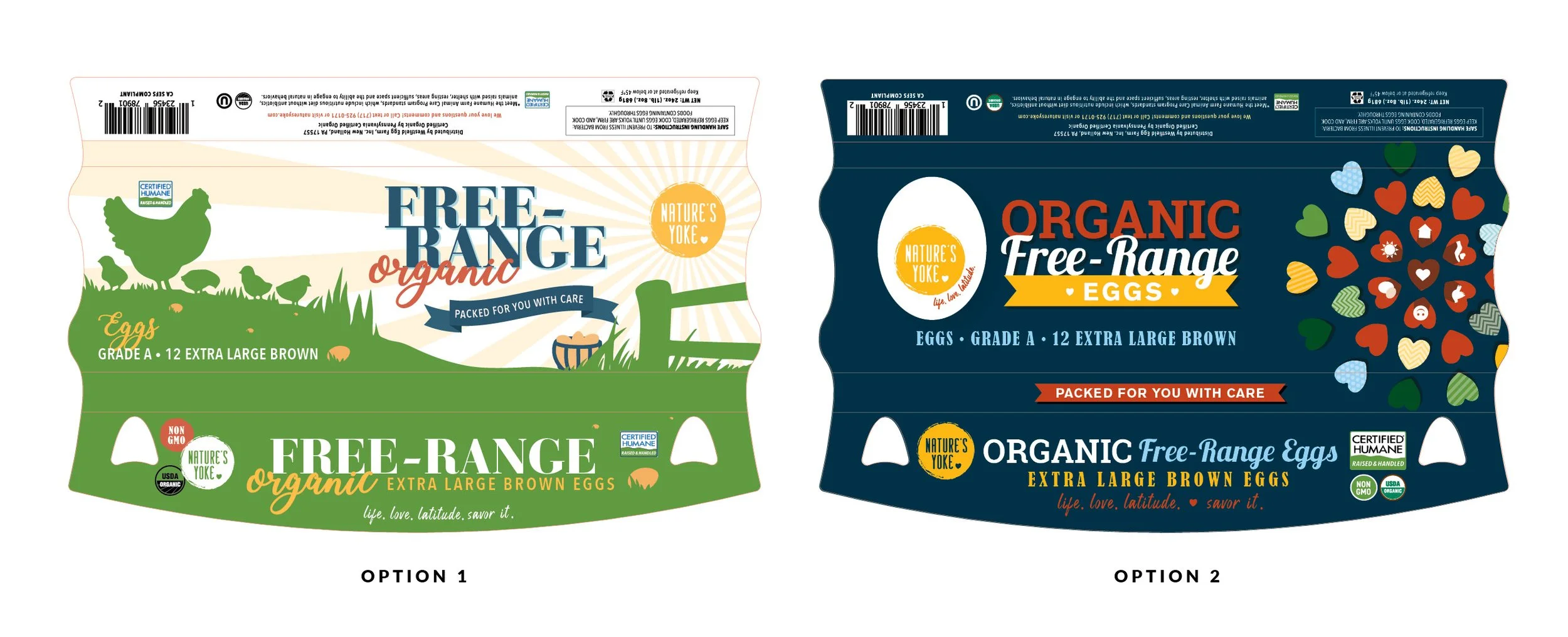
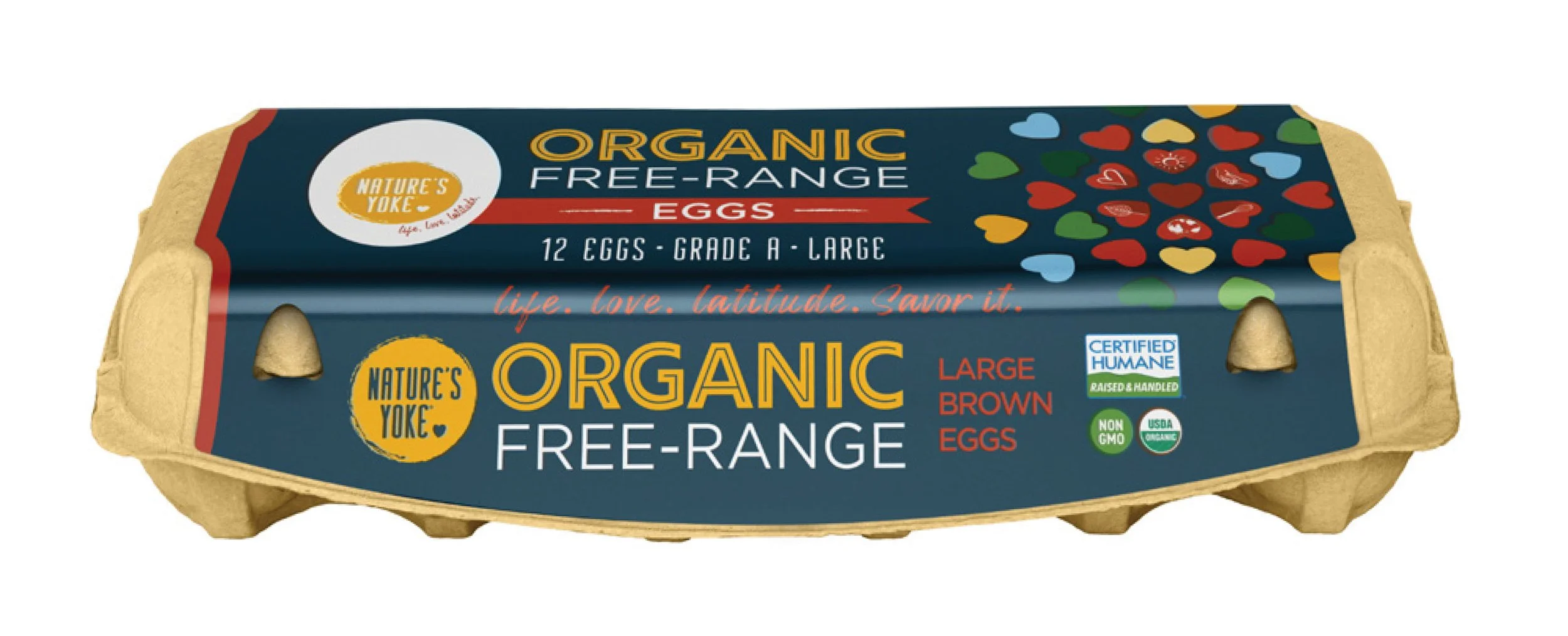
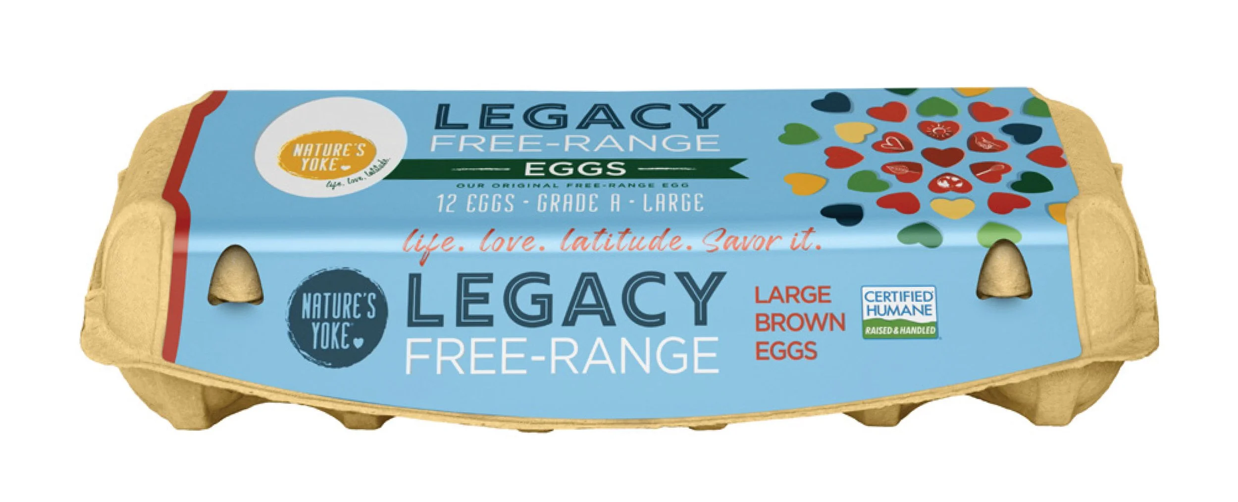
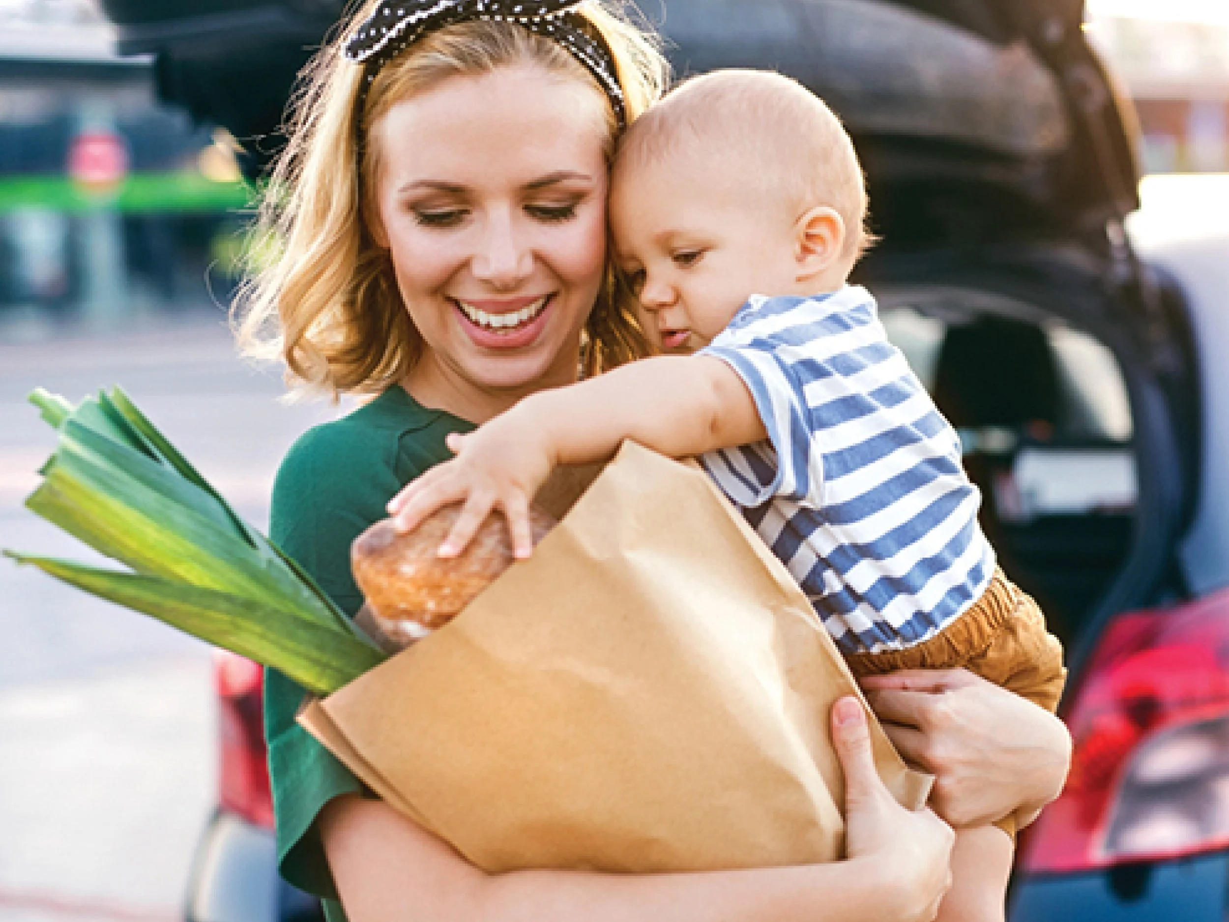
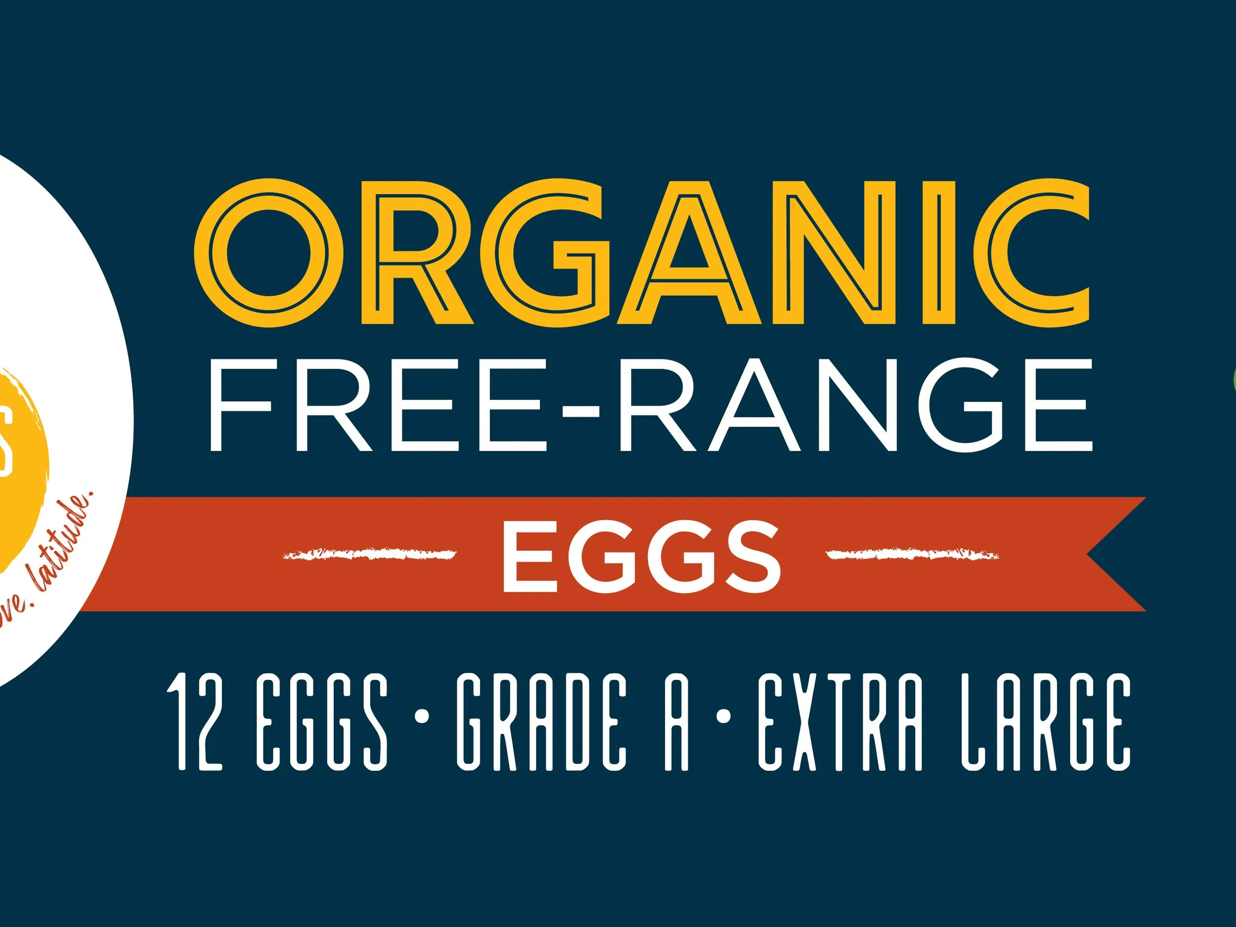
As part of a brand refresh for Nature’s Yoke, the team at B. Creative Group was tasked with reimagining their egg carton packaging to align with a new logo and updated identity. The goal? Appeal to modern families, especially busy moms, while staying true to the brand’s values: Life. Love. Latitude.
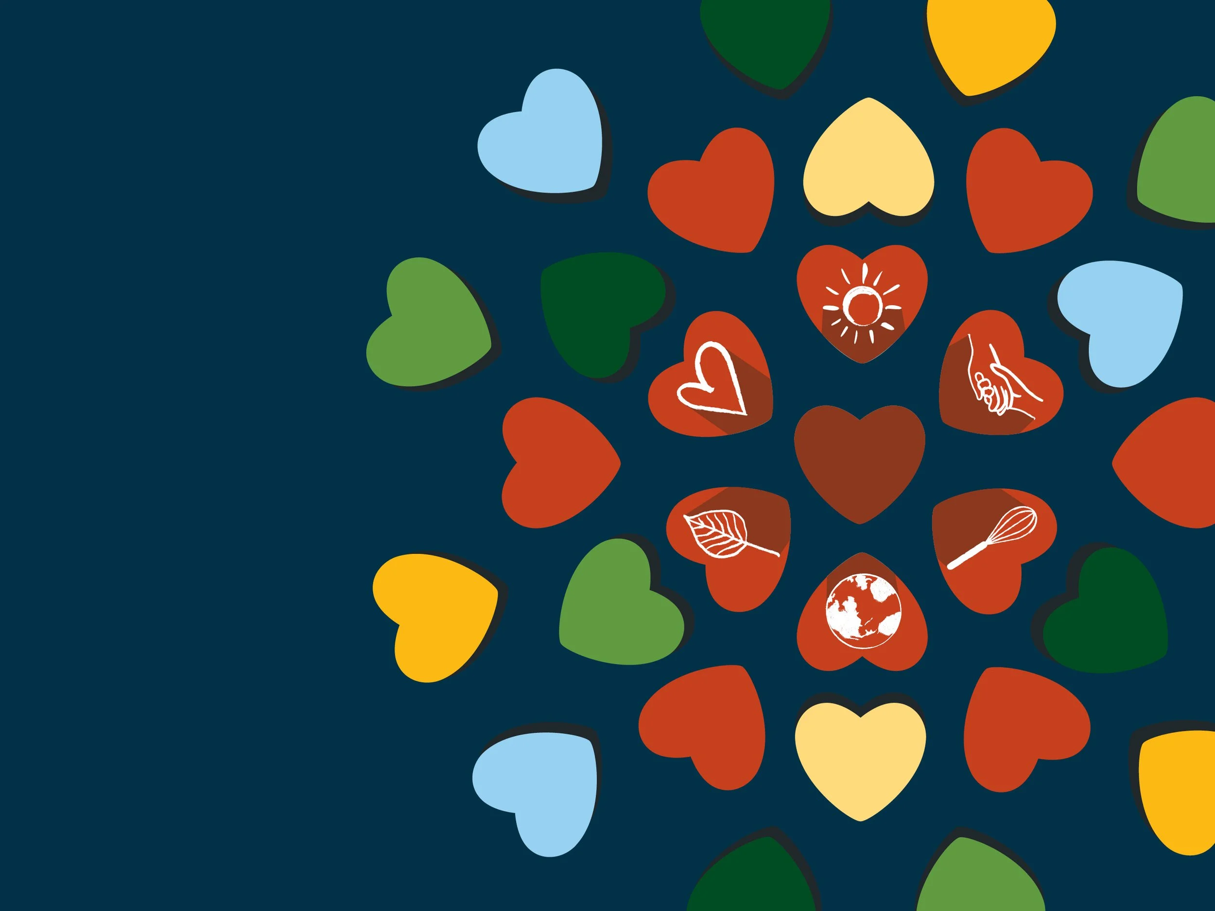
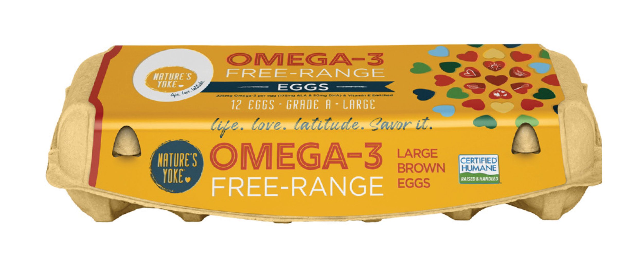
Working as a Junior Designer, I contributed multiple concept directions for both Nature’s Yoke and its sister brand, Utopihen. Pictured above are the two options I designed that were sent to the client. I’m proud to share that one of my Nature’s Yoke designs was selected (option 2 pictured above) and refined into the final product. The result was a playful yet polished carton featuring whimsical heart elements, friendly iconography, and modern type — all working together to tell a heartfelt story on shelf.
Crafted in Adobe Illustrator, this design was not only fun to create… it now lives on grocery store shelves across Maryland and Pennsylvania! There’s nothing quite like spotting your own work while picking up groceries.
Created with B. Creative Group